Maintain Wide Margins
Understanding the value of making a strong first impression extends beyond interpersonal interactions to literary works such as books and short stories. We’ve compiled basic formatting and design guidelines to improve the appeal and readability of your book. Considering how much time and work you put into writing your novel, the way it looks should reflect that commitment. An awkward or poor layout may turn readers off before they get a chance to enjoy your writing. Once engaged, the page design should easily lead them through your story. 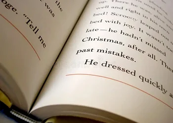
Even non-professional designers can use basic tactics to improve the aesthetics of their work, even though page design is an art. Examining every bestseller or classic, you’ll find underlying themes that enhance its appeal. You may use these themes to position your book among the greatest. To improve your literary presentation, read up on book formatting tips, learn about eBook formatting, and consider hiring an ebook ghostwriter.
Generous page margins are an important book layout component that many novice self-publishers need to remember to include. Although it makes sense to be tempted to enhance text density and minimize margins, doing so could be more effective. Strict margins make text appear visually constrained and intimidating, and they may result in word loss inside the “gutter” or inside the border. This makes reading the book difficult for readers, which detracts from their enjoyment of it. Choosing a large margin on all sides improves the book’s appearance, guarantees easy handling, and leaves space for annotations or notes.
Starting with a 5/8″ (.625″) margin for a 5 x 8-inch book and a 3/4″ (.75″) margin for a 6 x 9 book will yield the best results. Adjust the inside margin slightly larger to keep words from falling into the gutter. This is especially crucial for lengthier novels with deeper gutters. Internet resources are available for anyone wanting to learn more about this facet of book formatting. If you need help formatting a book, look into the resources to help you grasp the process and produce a professional book.
Choose readable and easy fonts.
Regarding book formatting, the font choice is pivotal in ensuring a reader-friendly experience. A “readable” font, in the context of a book, refers to a typeface that not only captivates at first glance but also remains comfortable to read over extended pages. Here, tradition holds sway, and fonts like Garamond, Janson, Caslon, or Minion stand as stalwarts in the literary world. With pedigrees deeply rooted in book cover design, these fonts guide the eye along a line of text, facilitating the recognition of letters as cohesive words. Their widespread use attests to their reliability and effectiveness.
However, to explore beyond these classics, prioritize fonts that ensure easy reading within paragraphs. Opt for fonts with a balanced appearance, striking the right contrast between thick and thin lines. In this context, the goal is to be cautious and prioritize clarity.
A readable font allows readers to focus on the words themselves rather than being distracted by the font’s aesthetics. While maintaining simplicity in the main body text, you can infuse creativity by selecting a livelier font for elements like the cover, title page, chapter titles, and other accents. For those seeking help with book formatting, font selection becomes crucial. Adhering to established fonts or choosing alternatives with readability ensures that the visual presentation enhances rather than hinders the reading experience. Seeking advice on book formatting advice is a prudent step, and exploring available resources can provide valuable insights into making informed font choices for a polished final product.
Make use of a leading and comfortable type size.
After selecting your font, pay attention to the typeface’s size on the page. If you enlarge it too much, you’ll end up with a “large print” edition. The typical reader will have to use a magnifying glass if it’s too small. Although the 11-point typeface is commonly used in current novels, this is only sometimes the case. Certain typefaces appear larger or smaller than others due to slightly varying letter forms. Determine how many words or letters can fit on a line. Try to keep each line of writing between 10 and 15 words (check multiple lines, not just one!).
The distance between lines, or the distance from the bottom of one line to the bottom of the next, is known as leading. You have extremely fine control over leading using a professional program like Adobe® InDesign®. Start with the automated setting and make adjustments as necessary. Compare single-spaced and 1.5-spaced text to evaluate which appears better if your software doesn’t allow such fine adjustment. Choose the font that is the easiest to read on paper by printing the same page at various settings. Get a second opinion from a buddy after that.
The first lines of paragraphs should be indented.
The new paragraph starting on the page should always be easily visible. If not, your text will appear to be a large, continuous block of words. Generally, it is best to indent the first line by a quarter of an inch. It’s probably too much, half an inch.
Some writers use a blank line to divide paragraphs, particularly those experienced with web design. That’s a decent practice for a text that appears on a screen, but indenting the initial line to signify new paragraphs in a novel’s pages is preferable.
Explain your text.
To “justify” a paragraph in typography is to align the text to form a neat, even rectangle that extends to the left and right margins.  This feature is available on all word processors and layout programs. It can first look a little strange. Writing texts with only the left margin aligned and the right border “ragged”—each line varying in length—is a common practice for most of us. However, just about any properly produced novel will have justified text. The concept behind straight margins is to facilitate reading very long text passages. Because of the uneven edge, your attention is not diverted from the words’ flow.
Employ footers and running heads.
Although it’s not required, a running head is the kind of element that completes the atmosphere of a book design. This is the small heading every page has above the main body of text. Running heads serve as an anchor for the text and guide readers through the book. A running head usually includes information, most commonly the book’s title and author.
Occasionally, the chapter title may show up in its place. On left-hand and right-hand pages, the headers are typically different (book title on the right, author on the left, to provide a frequent example). Here, there is some discretion. The header can be centered, or the text can be aligned to the inside margin and the page numbers to the outside margin.
The header can be centered, or the text can be aligned to the inside margin and the page numbers to the outside margin. Page numbers can occasionally be found below the text block in the footer rather than the header. These minor choices can significantly impact how your pages seem and the overall novel design.
Utilize page breaks
Page breaks should be used carefully when organizing your manuscript, particularly when dividing it into chapters. To generate a new page, avoid making the usual mistake of repeatedly hitting return. Instead, use appropriate page breaks for a professional presentation.
Place the pointer at the end of the chapter in programs such as Microsoft Word, then select “Insert>Break>Page Break” from the top menu. This guarantees a smooth transition between chapters and improves your work’s readability. If you’re looking for an affordable way to improve your manuscript, consider using a cheap ebook writing service to get expert advice and help structuring and organizing your work.
Give numbers to your pages.
Page numbering is a basic component of appropriate book formatting. Do not begin numbering pages on your title page; rather, begin numbering pages on the page where your story begins. To do this in Microsoft Word, double-click in the page’s header area where your tale begins. After that, select “Insert > Page Numbers” and the locations you want. Placing page numbers in the upper left corner guarantees a consistent and polished look.
Page numbers are essential to keep your work coherent and guide readers through it. This little touch improves the accessibility and reader-friendliness of your document and adds to its overall professionalism. Appropriate page numbering is an easy but effective way to present your work professionally and ensure readers can quickly turn the pages of your narrative.
Give careful attention to the chapter’s beginnings.
One of the most important things when creating a professionally prepared book is to give extra attention to chapter beginnings. Every chapter should begin on a separate page, highlighting a visual break between the various parts of your story. Except for the first chapter, which should constantly start on a right-hand page for traditional aesthetics, most books do not need chapters to begin on the right-hand page, although some do.
Put the content approximately a third down the page with the chapter number above to organize your chapter openings efficiently. To create a unified visual identity, use unique styling for chapter numbers and titles to differentiate them from the body of the content. Consider utilizing the same typeface to keep your book cohesive from cover to cover. Eliminating running headers from pages introducing new chapters is crucial in preventing a typical rookie error.
Furthermore, avoid indenting a new chapter’s opening paragraph. Depending on the capabilities of your software, try drop-caps or formatting the first few words in full capital letters or small caps.
These nuanced details contribute to the overall reader experience, signaling the conclusion of one story segment and the commencement of a new phase. For those seeking professional help in book publishing, including formatting considerations, exploring a book publishing service or a cheap ebook writing service can provide valuable support to ensure your book presents a polished and cohesive appearance.
Use a blank line to indicate scene changes.
Chapters frequently include scene changes in the midst. One blank line between paragraphs is the simplest method to convey this. This aids the reader in “resetting” and realizing that the viewpoint has shifted. To take it further, consider enlarging the break and adding a tiny decoration to the middle. If you keep it straightforward, this can be a fun and understated approach to further the theme or tone of your work.
In summary:
To sum up, fully considering book formatting enhances the reading experience overall and results in a well-designed and polished piece of writing. Recognizing the value of first impressions also applies to the literary world, where a few simple pointers can improve the appearance and readability of your book. Every element helps readers flow smoothly through the story, from keeping large margins to choosing readable fonts and sensible type sizes.
Using page breaks, numbering pages, and carefully starting each chapter are all essential components of a well-written work. Well-structured chapters that stand out with distinctive fonts and styling help to identify transitions and increase reader engagement. These subtleties mark the conclusion of one story arc and the start of another. Book publishing and inexpensive ebook authoring services are excellent alternatives for anyone needing help.
These services can offer expert advice on organizing and structuring your work, ensuring your book has a visually beautiful, cohesive design and captivating content. Ultimately, putting time and care into book formatting results in a satisfying and unforgettable reading experience.